
There are basic, everyday questions that charting tools still won’t let you ask.
We connected the dots to craft a whole new breed of answers.
Traditional charts and tables are truly powerful, but they can’t do everything.
If you need to ask questions about how a group of similar things — database servers, employees, goods moving in shipping network, customers in a marketing funnel, … anything really — relate to each other, you are probably asking a graph question.
We really can’t answer these questions?
There are some companies and products offering graph analytics, but they are niche tools that require specialized knowledge in shaping data and writing code.
Everyday people have graph-shaped questions and they should be able to answer them without writing code or waiting in a queue for IT.
I paired with a principal engineer and we led a small team to pitch a new application, codenamed Ursa. Like a constellation draws meaning by connecting stars, Ursa drew meaning connecting data points.
Why graph analytics?
To explain graph analytics, let’s start with a not-a-graph question. If you worked in HR and wanted to better understand your company’s gender diversity, you might have data like this:
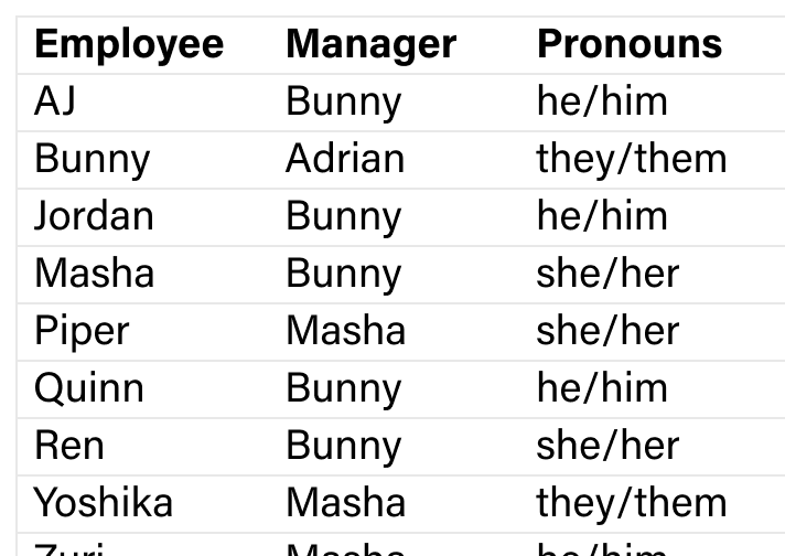

You might ask: What’s the mix of pronouns of Bunny’s direct reports? Visualization apps, spreadsheets, and SQL code can all answer this question with a similar approach:
Filter for Manager = Bunny
Count the frequency of each pronoun

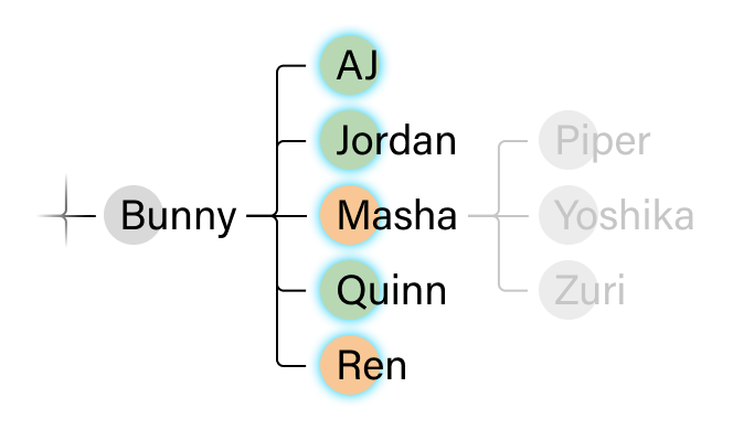
But what if I want to know about all of Bunny’s team — their reports, their reports’ reports, and so on?
That answer is scattered across rows, so there’s not a way to filter for Any Manager Anywhere = Bunny. The answer comes from multiple hops away from Bunny. This is where graphs are helpful.

Without graphs, it’s impossible to answer multi-hop questions.
Customer research backed up our vision.
We intended to build the first app that empowers everyday people to ask multi-hop, networked questions.
Our customers told us that’s exactly what they wanted, too. The world is full of these graph-shaped questions, with all kinds of data. Here are some customer stories I heard with my team.
Supply chain

3M, the manufacturing giant, has dozens of plants that deliver materials to each other in a complicated supply web. When a plant falls behind schedule, they cannot predict or communicate about impact beyond the plants they ship to. They need a model that goes more than one hop.
Data quality and provenance

Netflix has over 5,000 data tables. Some have raw data, but most are derived from other tables. When there’s a defect, they want to look multiple hops to find the upstream source and understand the downstream impact of a fix.
Market baskets

A political consultant wants to find new contributors to their campaign. What other campaigns did their contributors support? The donors to those campaigns are who they would like to target. They need to go more than one hop — campaign → donors → campaigns → donors — to do this market basket analysis.
The core UX loop
The Ursa team was me, a PM, and 6 engineers. Together, with lots of prototyping, Figma-ing, and whiteboarding, we identified the core UX loop: the tasks we needed to make silky smooth for typical business users.
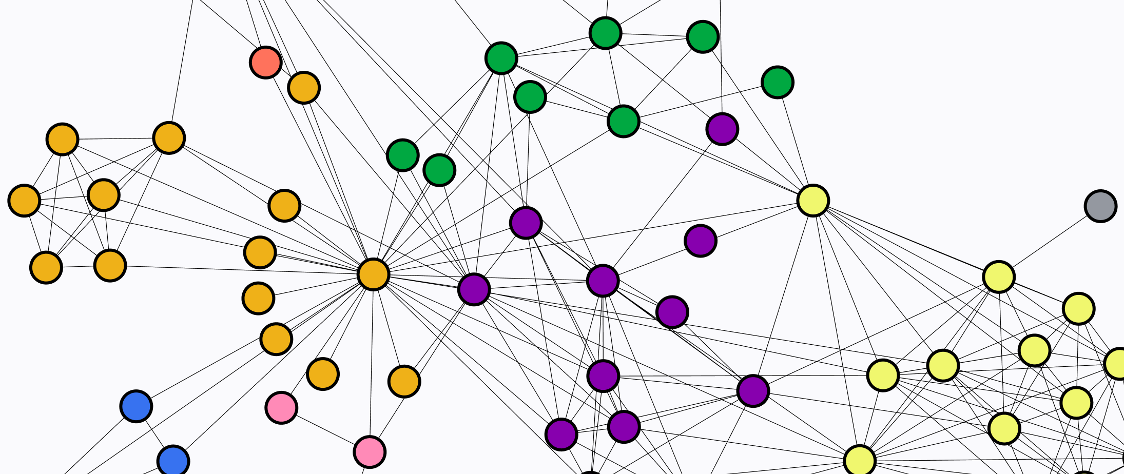
Show us the hops. Change the shape of the data from rows in tables to hops across data points. A single graph might come from one or multiple tables, so we needed to make an iterative, flexible flow.
Choose the path. Once the hops have been described, how do you want to move along them? Up- or downstream? Back and forth, like between campaigns and donors? A few hops or as far as you can go?
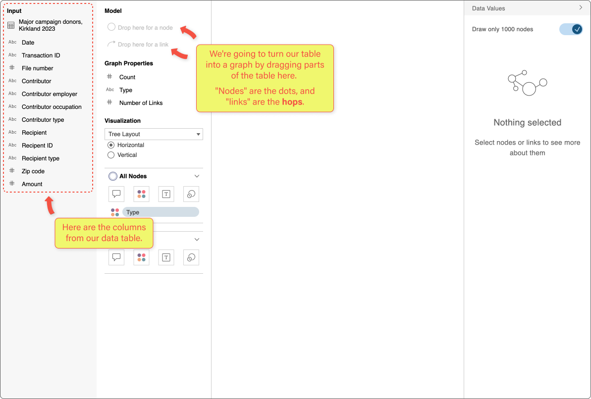
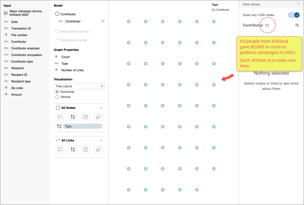
I want to give you a demo of our prototype using real-world campaign finance data. From the Federal Elections Commission website I downloaded a list of people in my town who gave $5,000 or more to campaigns in 2023. I got a table of 5,766 donations:


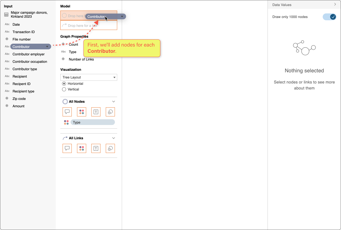
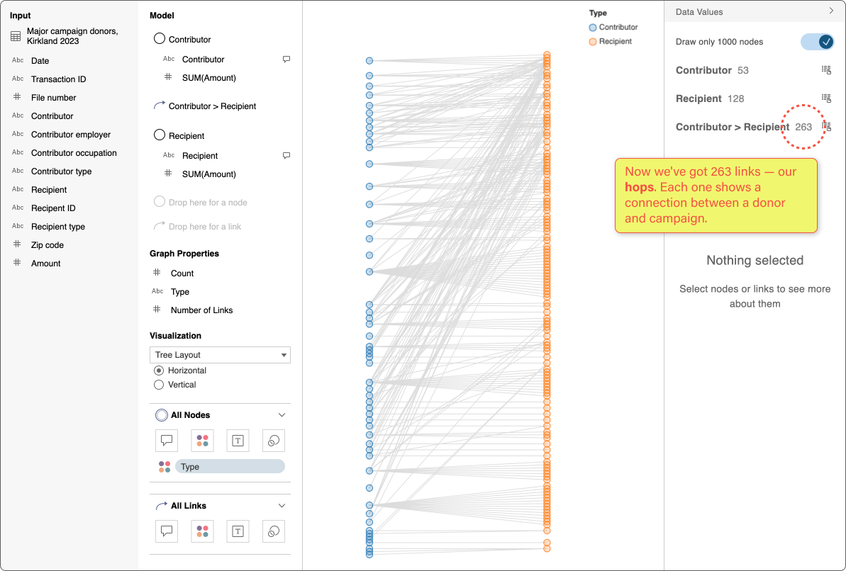
Step 1: Show us the hops
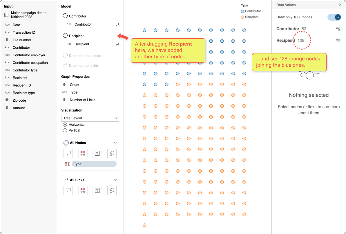
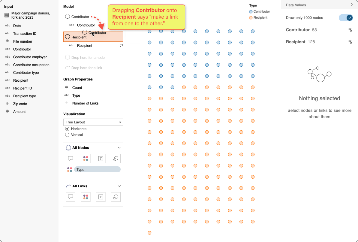
Each row in our data table is one donation from a Contributor to a Recipient campaign.
To ask our multi-hop questions, we need to change the shape of the data from a table into a graph. Contributors and Recipients will become nodes; the donations will be links (the hops) and we’ll learn about the data along the way, too.
How many donors gave over $5k?
How many different campaigns did they contribute to?
Were there any especially big donors? What committees got a lot of money?
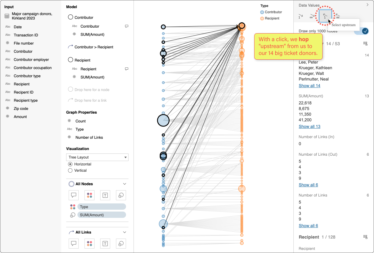
Let’s dig in. Click the purple arrow → to move through 8 screens.
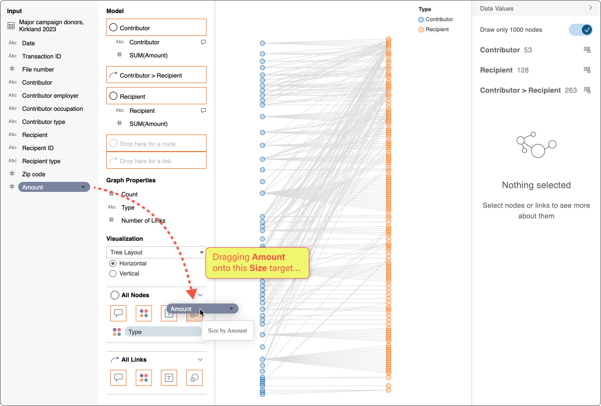
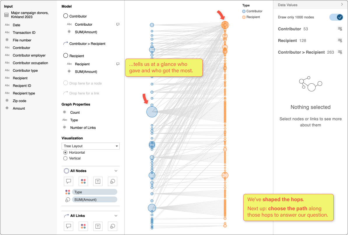
Step 2: Choose the path
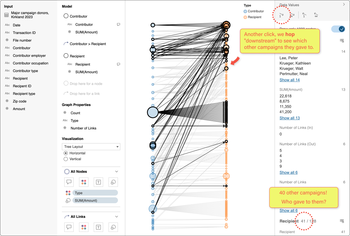
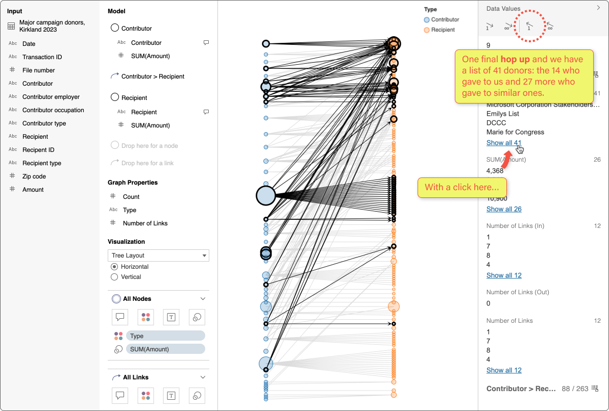
Step 1 changed the data from a table shape to a graph shape. Next, we take multiple hops along the nodes and links to answer our questions:
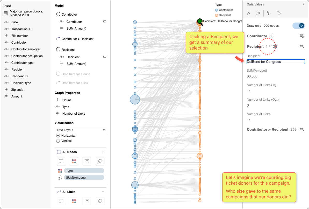
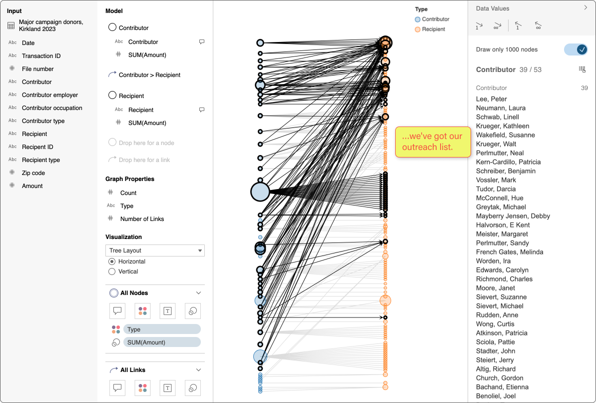
What other campaigns did our contributors support?
Who gave to those campaigns, but not ours? These are people we can target with a marketing campaign.
You might recognize this as a market basket question. In addition to cross-selling, market baskets support fraud detection and medical research.
Beyond the prototype, a design system
While building the prototype, we agreed the most important work was to enable flows to support user research. At the same time, I was also building a design language and system for the finished app.
Compared to the prototype, the fully-designed app window has more visual structure and a consistent rhythm.
Color and shape in the application’s chrome repeat key elements to build visual connections, while the text and iconography builds upon the Tableau visual system.
I also extended the Tableau design system with new affordances where needed, like graph data modeling. and I filled out other places that were under-defined or incomplete.

Internal and external customer research continuously showed a viable business model for Ursa. However, I left Tableau in 2023 to join Observable before the project had a chance to get greenlit.