
Color creates meaning for both data visualization and brand.
Could we find means to both these ends at the same time?
Color is a cornerstone of nearly every dashboard. Used effectively, color reinforces a dashboard’s story, explaining data and expressing a tone or brand.
However, when incorrectly used, color muddles your communication or dilutes your brand. When the same shade of blue means “Eastern region” in one chart and “service interruptions” in another, viewers need to work harder to read the dashboard, or they might simply misinterpret the data.
And our default shade of blue came straight from a competitor’s brand, making every chart a lost opportunity.
Every chart created in Observable was on brand for Tableau, but not Observable.
When I joined Observable, charts made with our tools used Tableau 10 as their default color palette. While it’s beautiful and effective for data, it is also intimately tied to their staid brand.
In contrast, Observable’s brand colors are bright and contemporary, matching the creative spirit of our open source, expressive framework.
It was time for our own color scheme.
Say hello to the Observable 10.


First, principles.
To design these colors, I first set out some goals.
Offer as many colors as possible to support the creation of rich, multidimensional data displays.
Connect to our brand.
Support visual differentiation, even in small or thin marks. Two small dots on opposite sides of a scatter plot need to read clearly.
Consider people with color vision deficiency.
Use colors that readily map into common names like “blue” and “orange.” (Let’s avoid questions like, “Are you talking about the blue-green dot or the green-blue one?”)
Work on both light and dark backgrounds. As a platform, Observable should work regardless of your vibe.
Start from the brand
My second principle gave me a starting place: our brand guidelines. They had the above seven core colors.
It’s easy to see that Faint Blue and Washed Yellow would not work on light backgrounds, so I tossed those out. To see how the remaining 5 colors would work together, I built an Observable notebook so I could see the colors in two side-by-side charts as well as in text and common mark shapes, like this:

Looking at our starting palette in the visualization above, we can see that the 5 colors vary significantly with their angles, so it’s a promising start. However, Mint Chip and Goldenrod are very close to each other on the L* lightness scale, and we’ll want to keep an eye on that.
The CIELAB color space
These charts show the colors in CIELAB (or sometimes just “LAB”) color space. Unlike RGB or HSV, LAB covers the entire gamut of human visual perception, and it does it along three dimensions: a* (“a-star”), b*, and L*. a* is a spectrum between green and red, while b* runs along blue and yellow. L*, for lightness, goes from black (0%) at one end to white (100%) at the other.

This illustration shows how LAB mirrors typical perception. We see many different shades of green and blue from 6 o’clock to 10 o’clock, but we can differentiate very few different yellow hues around 12 o’clock.
Using LAB this way, I was following in the footsteps of Maureen Stone, one of my colleagues from Tableau and a visionary in the world of digital color.
Adding more colors
To fulfill my primary goal, I needed more than five colors, so I tried adding five more. I kept the blue, purple, and red (formerly Coral) as they were and dropped Mint Chip in favor of two colors: a cyan a little closer to blue (3) and a true green (8). Orange (1) became a little less saturated and lighter. I also added a cool gray (9) right near the center of the scatter, pink (5), and brown (6). The final addition in this draft of the palette was light blue (7).

Visual accessibility
Goal #4 was to create a palette that could work reasonably well for people with color vision deficiency (CVD). The most common CVD is deuteranopia, a lack of red-green differentiation that affects about 4% of people.
Using a tool like Color Oracle, I could simulate what the palette looks like for people with this form of CVD. Happily, most of the 10 colors were distinguishable. It was not ideal, but a truly CVD-safe palette with more than 6 colors is quite difficult.

In this drawing, you can see the cyan (3) and pink (5) are very close. The two colors have very different a* values, but they are similar on both b* and L*, which is why they can be problematic for people with deuteranopia.
However, when I tried to shift either of those colors along b*, I found them too close to other hues, creating other differentiation problems. I decided to leave the cyan and pink where they were. In practice, if I made a chart that used both these colors, I would use an additional channel to help with differentiation. Options include labeling with text, using different shapes, adding hover tips, or even changing to using bars or another positional mapping.
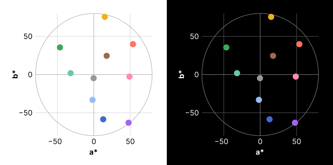
Embracing the dark… and the light
The final goal for the palette was to work in both light and dark mode pages. Using our test suite of dozens of charts rendered on both white and black backgrounds, I saw that on light backgrounds the orange (1) was not dark enough, and one tester reported that the green (8) was too vibrant for them on dark backgrounds, almost like it was buzzing.
To address these problems, I experimented with other nearby colors. I chose a more saturated orange, moving it farther away from the center of the scatter plot, and a darker green farther down on the L* plot.


Observable 10 launched in December 2023 as the default color palette in Observable Plot and was added to the industry standard D3 charting library.
The accompanying blog post (from which I adapted this article) was one of the most popular posts of the last year, second only to the Observable 2.0 company re-launch post.