

Spreadsheets were on clay, papyrus, and paper for millennia.
In 1979, VisiCalc made them digital, inviting normal people to be accidental programmers.
So why are digital notebooks just for programmers?
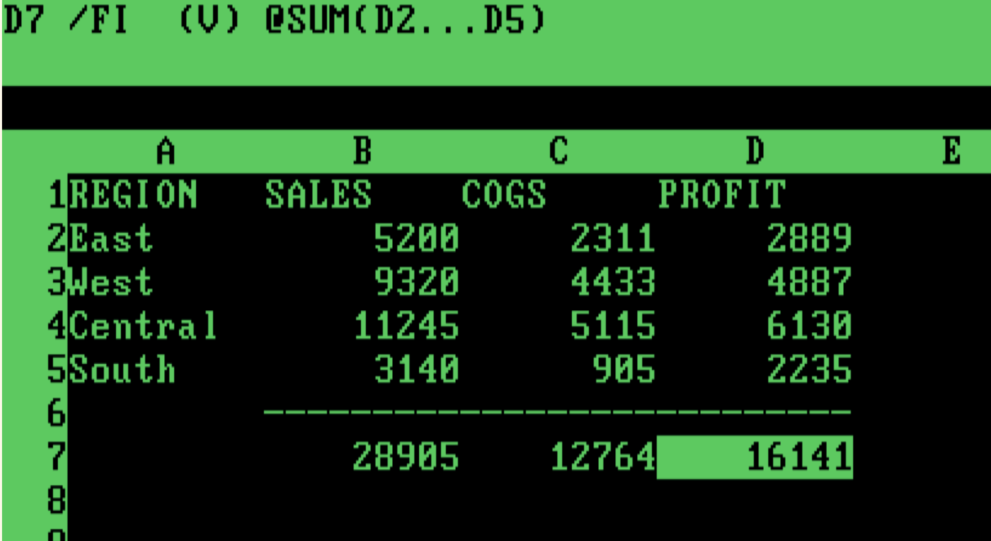
VisiCalc, the first spreadsheet, let business users write and debug programs without naming a variable or seeing a screenful of code.
VisiCalc’s reactivity made this possible. automatically determining the order of operations across cells. Today we take this for granted as what spreadsheets do, so it’s easy to overlook the significance of the UX innovation.
Reactivity helps break complex problems into smaller steps, see the results as you work, and lay them out in a way that helps document and understand the process.
Reactivity connects relatively simple spreadsheet formulas together like Lego bricks, making something much more interesting than its parts.
There’s another type of application that builds on reactivity: digital notebooks. Notebooks like Jupyter are similar to spreadsheets — with scrolling text instead of rows and columns. Unlike spreadsheets, though, this powerful and popular medium puts up a huge barrier to entry: notebooks expect you know how to code. At Observable, we asked:
What if notebooks could be a tool for everyone?
Welcome non-coders — and grow the business
Observable’s mission is to help people understand their businesses through data. In 2023, Observable’s flagship product was Notebooks. Like other notebooks, it was for coders, engineers, and data scientists.
But the people who understood the business problems couldn’t use Observable to answer their questions.
We saw an opportunity: notebooks could be a place where a whole team could collaborate. To get there, we had to make notebooks more welcoming for non-coders.
The opportunity
Working with Product, Engineering, and our CEOs, we set our sights on making notebooks a place for collaboration by establishing measurable goals for our business and our users. Our business goals were to:
Validate product-market fit for non-coders by seeing more people contributing prose to documents.
Increase revenue in the next 1–2 quarters by increasing sales to non-coders.
Drive awareness and growth through increased engagement and sharing.
Our goals for users were:
As a non-coder, I can contribute to a notebook by adding and editing text.
As a spreadsheet-savvy non-coder, I can build and modify basic charts.
First obstacle: welcoming everyone to write
Observable notebooks had always been coder-first tools. When a non-coder opened a notebook, they thought they were seeing a web page, or a developer’s tool.
For example, if they clicked in a paragraph of text, nothing happened. It was like any other web page, static and read-only. If they happened across a code cell and they clicked on it, though, that was where you got a blinking insertion point and its invitation to type.
In order to add text, they would have to discover a little + icon in the margin. When clicked, it would show a menu with coder-first options like JavaScript, Markdown, and HTML. Nothing about the experience welcomed non-coders to contribute.
Plan A: What if they could just… click and type?
My first hope was to add rich-text editing to the page. Clicking on any text would just work, whether it was written in JavaScript, English, SQL or Russian. Code and prose, coders and non-coders, would all be on equal footing.
However, we were a startup with a small (but scrappy!) team, and adding rich text editing would be a big lift for both design and engineering. We agreed that while rich-text editing was the best way to meet our user goals, it would not meet our business goals. It would take longer than a few months to generate signal to measure adoption and revenue growth.
Plan B: The Add Cell bar
My next-best idea, and the option we implemented, was an Add Cell bar. This was a svelte little toolbar that appeared above and below the active cell, as well as at the end of the notebook. Here it is, with hover feedback on the new Text button.
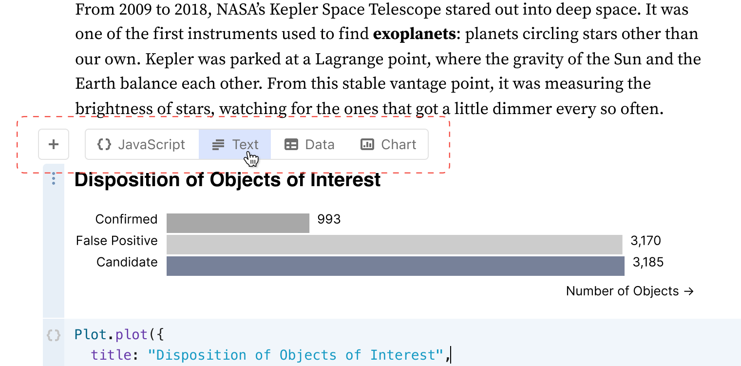
When business users saw the Add Cell bar, they realized they weren’t on just another webpage, but a live document. And by ditching jargon like “Markdown” and “HTML,” we let coders and non-coders alike see anyone could add text.
Text, and charts, and tables, oh my!
The Text button was a good start, but Observable notebooks offered more ways for non-coders to contribute than simply writing text, which is why I also put Data and Chart buttons on the bar.
Clicking Data inserts a no-code Data Table cell. Data Table cells are interactive, mini-spreadsheet views of a database table or a data file. With it, anyone can filter, sort, and validate data. The Chart button adds a no-code Chart cell that lets anyone build simple graphs using only drop-down menus.
Beyond no-code to low-code
The Add Cell bar was a great start, but could we make notebooks draw people into being creative with simple programs? Could we repeat the magic of spreadsheets and get non-coders to start writing and connecting bits of code?
Observable Notebooks had another card up their sleeve.
There was another feature hidden away from non-coders: snippets. Snippets are fill-in-the blank templates for building charts. Here’s one to make a bar chart, with its three blanks filled in with default values to use the built-in alphabet sample data to show each letter’s frequency in common English text.
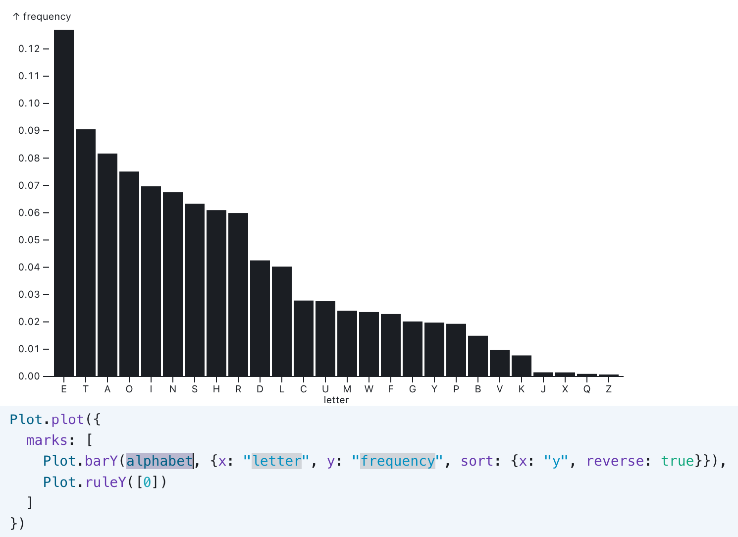
Not only did snippets open access to new kinds of charts — beeswarms, Voronois, box plots, and more — they introduced the idea that it took only a few lines of fill-in-the-blank code to unlock new avenues of expression.
The next obstacle: a closed funnel
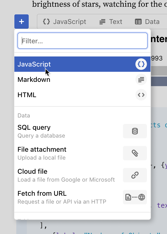
At the left of the Add Cell bar, we still had the + button. It opened the Add Cell menu as it looks here.
As implemented, the menu did little to convey the expressive potential of Observable notebooks, especially not to non-coders.
It was packed with unnecessarily technical jargon.
The icons did little to explain function to a technical audience, and even less to a non-technical one.
There was no mention of charts above the fold.
The Filter box gave no indication of what it filters.
Opening the funnel with a better menu
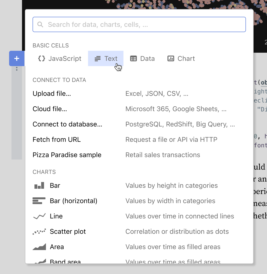
Building on the Add Cell bar, we implemented a new Add Cell menu.
The basic four cell types — JavaScript, Text, Data, and Chart — carried over from the Add Cell bar. Putting them all on one line simultaneously made them more prominent and opened more vertical space for other items.
Unhelpful icons from the Data section were removed and replaced with concrete examples of what kind of data each command would let you use.
Chart snippets, previously below the fold, moved up and got cleaner icons.
Text was made a uniform and larger size, to improve legibility and accessibility.
The “filter” box at the top of the menu was given a clearer label and a more standard “Search” description.
Not visible on the menu, we also added additional search keywords for many of the items. This meant that users, both coders and non-coders, would be more likely to find what they were looking for, even if they had a different term than what was in the menu.

The new Add Cell bar and menu shipped in Fall 2023.
In-product instrumentation showed significantly increased usage of the Chart and Data Table cells by both coders and non-coders.
Usability tests and customer conversations showed that non-coders understood the platform better and were more likely to engage as creators.