
Tableau had shipped AI‑powered analytics, but a bad UX severely limited adoption, putting our reputation for leading the industry at stake.
I reimagined our approach to AI analytics. To ship it, I first had to find a new rendering pipeline and restore Engineering’s ability to complete platform-spanning work.
Just as LLMs were advancing toward credibility, Tableau stumbled backward with our first major AI-powered feature, Explain Data. Its output was confusing and hard to use, falling far short of customer and market expectations and creating a competitive threat.
The AI behind the feature was solid and Tableau was known for its design leadership, so what happened with Explain Data? I discovered underlying, platform-spanning technology and operational problems; addressing those unblocked a completely different, successful approach to the design.
Technology
I did a root cause analysis of Explain Data’s chart drawing issues and developed an alternative architecture that we implemented.
Operations
I uncovered how code ownership rules had been preventing critical work across the platform, including the key to AI-powered analytics. I drove an Engineering org change to unblock that work.
Design
I shipped a completely new UX, transforming it into a marquee AI feature, expanding our design system, and creating a foundation that continues to support new analytical tools in Tableau.
Explain Data’s design was broken.
Tableau had acquired a world-class data + AI company, and the first fruit of this acquisition was Explain Data.
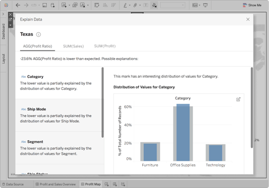
Explain Data offered insights about why a chart looked a certain way. For example, if I got curious about why a low profit ratio colored Texas bright red, I could select it, bring up Explain Data, and it would show me previously hidden patterns in the underlying data.


The AI delivered solid insights, but the UX put on it had some critical flaws.

It made users think it had The One, Right Answer.
In truth, Explain Data found multiple likely insights among thousands of possible explanations. But putting a colorful chart up front and hiding the others behind two layers of tabs hid the truth.
We needed a catalog of options instead of a hero image.

The big idea was use the AI insights to dig into the data — but you couldn’t get to both at the same time.
The patterns Explain Data found were meant to be signposts for exploration, suggesting how to use Tableau to separate correlation from causation. But its dialog box covered up most of the app window. (Moving the window aside didn’t work, either.)
We needed a side-by-side view of insights and data.


Many of the charts looked bad or were just broken.
Explain Data’s charts were all static images drawn at the same size. Without scrolling or resizing, two bars in a chart were awkwardly fat while a chart with 30 bars was illegible.
Static images also created convoluted UI language because we could not directly point at things.. (e.g “Avg Trip Distance for Prudential Center - Belvedere St…” instead of “This…”)
We needed interactive charts instead of snapshots.
To fix Explain Data’s design, I needed to dig deep into not just the design, but also the code and the team writing it.
Step 1
Figure out what had led smart and skilled people to ship something broken.
I identified three big problem areas—technology, operations, and design.
Problem #1: Technology
The chart rendering system could not meet our needs.
Tableau’s genre-defining UX has a powerful rendering system. It scales to thousands of data points with rich interactivity like hover tips, dynamic filtering, and web hooks.


It seemed like a system this powerful should be fine for a few small charts, so I investigated how it could support our needs. The answer: the renderer could not work for Explain Data for two reasons:
Explain Data needed scrolling and hover feedback, but the Tableau event loop supports only one interactive display at a time. We could not catch mouse or keyboard input from a second set of charts in the Explain Data UI.
Explain Data needed to draw charts that were readable with either 2 bars or 200 bars. While Tableau’s renderer can make a chart at any size you give it, it cannot report at what size it would draw a bar.
I realized we needed another renderer for Explain Data, and recommended the one I thought would be best.
This renderer needed to be able to run alongside the rest of Tableau, have its own event listeners, and be able to negotiate the correct size for a given chart.
I knew that D3, an open source, web-based library would probably meet all those needs, so I asked our engineers to determine if it was feasible to use a browser control and embed D3 in it.
Problem #2: Operations
Our engineers would be penalized for creating the platform-spanning component we needed.
Explain Data’s insights needed to be side-by-side with the data they described, not trapped in a dialog box layered on top of the data.

This kind of side panel would be a new shared component. It would need to negotiate layout with other top-level components and it should be built to hold more than just Explain Data.
However, engineering on shared components like this had essentially stopped at Tableau. This was an unintentional side effect from the intersection of reasonable choices:
A major metric of Engineering teams was the velocity of their new feature work.
To ensure every line of code had an owner, a team that changed a component owned its maintenance.
There was no team dedicated to building shared components. (There had been one previously, but it had been disbanded to support strategic big rocks.)
Even when an engineering team saw a better holistic approach, they always chose a one-off solution. If they had built a shared component, their velocity would have slowed as they spent time addressing the issues uncovered as other teams used their component. They might get a shout out for being team players, but the slower velocity would be a bigger, negative drag on their careers.
I needed to unblock creation of shared components by aligning engineering incentives with our business and customer needs.
To my peers in engineering director roles, I pitched rebuilding a shared components team. This would create an explicit incentive for Engineering to meet customer needs that spanned feature teams. Starting with Explain Data’s needs, I built a business case with a laundry list of customer requests that had been shelved because they also required shared components.
In parallel, I convinced the principal engineer and engineering lead on Explain Data to try building a side panel. My argument had both carrot and stick: the principles supporting the new design paired with the pain caused by the existing design.
They were willing to code a side panel and see whether it could make the difference I promised. Together we made a bet that a new shared components team would be able to take ownership of it.
Problem #3: Design
The existing UX provided no customer value.
“I did not care for Explain Data. It had very little use to me or most anyone using the tool.”
— Adam Mico, Tableau Ambassador
We had put a junior designer with light technical understanding on a tight deadline.
The result was a confusing and counter-productive design. It eliminated the impact of our acquisition and left Tableau open to being leapfrogged in AI + data.
I saw what was possible beyond our engineering and operations limitations, and I needed to sell the solution.
To sell to the feature team, I started rapid iteration on a prototype that assumed we would have interactive charts and a side panel. My core team had our PM and engineer, of course, and I also included a data scientist (to help refine the new charts and text) and a user researcher (who embodied our customer feedback).

To sell to directors and VPs across the team, I built a pitch deck. I presented and iterated relentlessly, refining the story both of Explain Data and the engineering and operational changes it would need. This created awareness and engagement that directly supported the feature team’s work and set us up for a successful pitch to restart the shared components team.
Step 2
Write directional user goals to keep alignment on teams and buy-in from stakeholders.
I am often asked, “How do you handle disagreements between Design and Engineering (or Product)?” Teams spiral into endless debates about priorities when they are not internally aligned.
Another is, “How do you keep stakeholder buy-in?” Shifting priorities or growing doubt from leadership kills projects and demoralizes teams.
Directional user goals help avoid both of these problems.
Directional user goals create a shared understanding of Design value.
When prioritizing work, Engineering cites effort and risk and Product brings up usage and revenue. Those are all things that everyone understands and can treat as currency when negotiating trade-offs. Design, on the other hand, is often left pointing at principles and design systems and saying “Trust me, we need this.”
Directional user goals address this problem by creating another currency everyone can understand, one that’s indexed to Design. These goals are more specific than principles or a “North Star,” creating a concrete system for comparing the Design value of different solutions.
For directional user goals to work, they need to durable and authentic.
Durable — They were true 10 years ago and will be true in another 10 years, and are independent of technologies or implementations. (Notice how usage, revenue, engineering effort and risk are also durable measures?)
Authentic — They address real human wants and needs. They are not fabricated excitement for an upcoming release, scaled to what we already know how to build, or about advancing the business.
Drive agreement on the goals and repeat them with benign obstinance.
For Explain Data, I led the feature team leaders in drafting and finalizing our directional user goals. Two of them were:
As a user of a dashboard…
I can discover and understand hidden patterns in this data.
I can use my domain expertise to separate actionable root causes from correlation.
By getting the feature team on board with these goals, we had a shared understanding of the value of work. “This costs 3 engineer-weeks, but makes it harder to discover the hidden patterns.” Everyone on the team could articulate the cost/benefit, regardless of their job function.
When talking about Explain Data with stakeholders in leadership, I would start every time by reiterating the directional goals. This grounded the discussion by connecting the dots between specific design choices and the value they created for customers. More understanding meant fewer redirections and questions and more support before we even committed our first line of code.
Step 3
Execute the work, clear room for the team, close the open issues.
With the groundwork laid, I shifted into the iterative process of finalizing the design, driving the technical and operational changes, and shepherding everything.
Design
Run ahead of Engineering to clear obstacles and give them flexibility and clarity.
This is the straight up execution part of the work: drawing, prototyping, selling, iterating, negotiating, and more with a focus on closing issues. I’ll highlight a couple specific aspects of my work.
Overcommunicate with the feature team.
While my Figma file exploded into multiple paths and corner cases, my watchword was communication. This meant diligence across the board.
I presented my latest work at least weekly to the feature team, focusing on the places where we had the biggest schedule risk. This made space for questions and built my relationships with the whole team, as well as making sure that even the folx who never opened Figma had an idea what was happening.
I clearly labeled everything in Figma with “Start Heres” and status—from WIP to Ready for Dev. My goal was to minimize the need for anyone to reach me in real time. Everyone from early birds in Seattle to night owls in Boston should stay unblocked by tactical execution questions.
I drove conversations to comments in Figma where possible, so there was a single place of record.
Drive the details to closure.
The new design had two big, structural changes that cascaded into details throughout.
A new information architecture moved away from nested tabs to web-style navigation.
Interactive charts needed to have all that interactivity described, including layout, resizing, scrolling, and hover tips.
In particular, all the UI text needed to be rewritten, so I took advantage of this to make advanced statistics concepts understandable to a typical business user. The existing explanations had often been too technical and were all written without interactive charts in mind.
Working with the team’s PM, data scientist, user researcher, and content designer, I rewrote hundreds of lines of UI text. The content designer built a style guide so that future types of insights would fit alongside what we had already done.
Technology
Replace the rendering engine and the dialog box.
The first few weeks of execution, I spent a lot of time with the principal engineer who was building the side panel, filling it with a browser control, and integrating D3.
We soon got the new renderer working and replicating most of the visual style of Tableau’s design guidelines, letting me turn my attention to other parts of the design. However, the rapport and shared expertise we built paid dividends for the remainder of the project, accelerating decisions without needing both of us to be in every meeting.
Operations
Restart the shared components team.
While Explain Data was in development, I continued to sell Engineering leadership on funding the new team.
A couple of the directors more clearly saw how they could deliver customer impact with shared components. I kept in close touch with them, repeating the mantra of the directional user goals and tying that value to the feature in development. They agreed to help pitch restarting the shared components team at the next quarterly review.
At the same time, I was creating a receptive audience for the pitch among the broader leadership team. I asked other designers to remind their Engineering and Product counterparts about completed designs that would use shared components. I had 1:1s with many of the Engineering leaders to show them what the Explain Data team was accomplishing.

In the end, the new Explain Data we shipped was the upgrade we needed and our customers wanted.
This release cemented Tableau’s early leadership in AI for analytics. It was featured in the annual conference keynote. Customers loved it, even to the point of one dedicating an entire blog post just about how much better Explain Data was..
“I love the stronger capabilities of [Explain Data] in this version. The data analysis is smart and sensical for a basic exploration of the data with the invitation to dig deeper. It has a lot of helpful contexts.”
— Adam Mico, Tableau Ambassador
Metrics echoed this feedback, too. We saw Explain Data was opened more often and captured more clicks.
After the next quarterly review, Engineering leadership funded the new Shared Components team, which ensured the Explain Data engineers could continue innovating with AI.
This new engineering team also addressed long-standing customer requests that had been stalled. Core upgrades to dashboards and formatting landed in the coming quarters, as well as sorely missing quality-of-life features like password peeking and a chip picker..