

Design craft places beautiful details in the right context.
Design goes both top down and bottom up.
Most of my portfolio tells the story from a top-down perspective: customers, business opportunity, and finding the path that meets both those goals.
At the same time, I work bottom-up with a careful, almost obsessive, attention to detail. Whether it’s best practices using tools like Figma or the creation of physical artifacts, I pay attention to how my work will be received and understood.
Welcome to the gory details.
Polish in process
Professional kitchens and wood shops start and end their days in neat order, ready for whoever and whatever comes next. Design files should be no different.
As I work in Figma, I create components, label layers, and mark work-in-progress. I liberally use sticky notes and comments. This helps me think through through the structure of my choices and return to work easily after breaks. And my teammates can drop in whenever they want, no matter where in the world they work.
Better still: this up-front cost accelerates delivery when engineers get to work and I need to iterate quickly to keep the team moving.

Data and decor
This visualization of US weather events was made to hang in the Tableau Design Studio along with other designer-created works.
With careful use of labels and thematic grouping of hues, I was able to omit legends and axes. These choices put focus on the data and made the poster interpretable at a distance. (Data: National Weather Service. Map images: Mapbox, OpenStreetMap)

Design systems
Documentation of shared best practices takes attention to detail. Working on specific features both takes advantage of a design system and extends it when and where appropriate.
This is part of the extensions and clarification I brought to Tableau’s design system from my work on Graph Analytics. Both the designs themselves and the documentation around them used the typography, spacing, and colors of the existing system.
States and corner cases
Even with a mature design system, designs will exceed the edges of shared understanding. There’s no substitute for closely describing states and corner cases. These drawings illustrate the nooks and crannies of a toolbar and menu component I designed for Observable notebooks.

Rest, hover, and activated states for a toolbar + menu component

Designs need to address edge cases like empty documents.

Responsive design should focus on the most relevant function as well as adjusting the form.
Prototypes and video
A short video, a click-through, or an interactive prototype can capture the feel of custom interactions better than any number of static drawings and redlines. This animatic-syle short clip illustrates hover feedback and how opening the menu keeps the position of the button bar stable.
Physical design
My work in physical media includes theater props and costumes, pastries, and puzzles and games. Adding real-world interactions and durability elevates the importance of testing and attending to details during production, an idea I have carried back into my digital work.
This paper-folding word puzzle from a Tableau Conference puzzle hunt took several iterations to be both engaging and accessible.

Draw for now and later
Lofty intent aside, designers need to simply produce enough screens to enable the team today and show them what tomorrow could be. Both the practical and visionary should be shown as pictures.
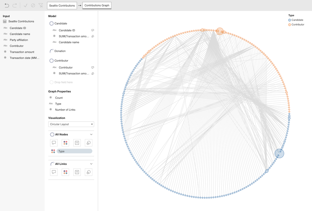
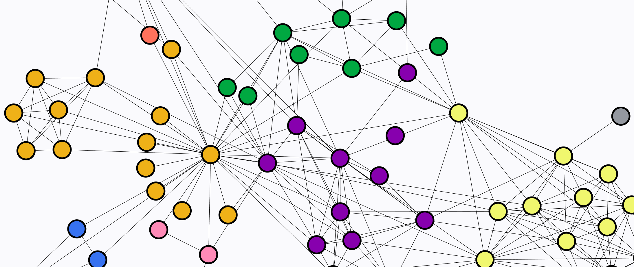
A recent example was the Graph Analytics project, where I was designing for a pilot needed for user research and for the blue sky in parallel. The first screen here is from the pilot. It matches the capability of the running code, integrates aspects of the design system, and points toward the blue sky.
The second screen is the blue sky, the intended destination, showing functionality a little beyond what was planned for the first release.

More in the portfolio
Visual Graph Analytics: Breaking out of bars and tables
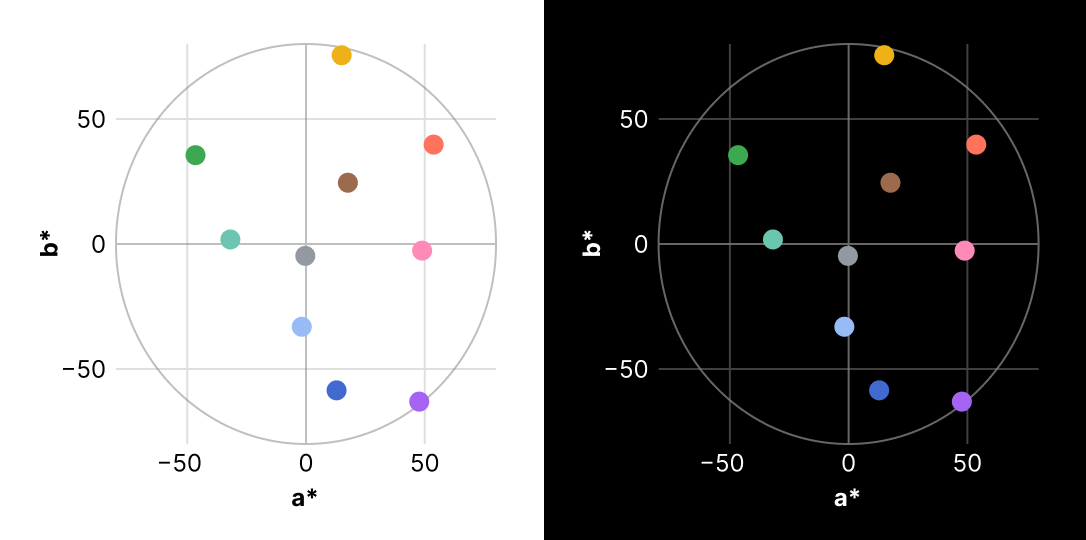
Observable 10 color scheme: Brand colors meet data magic